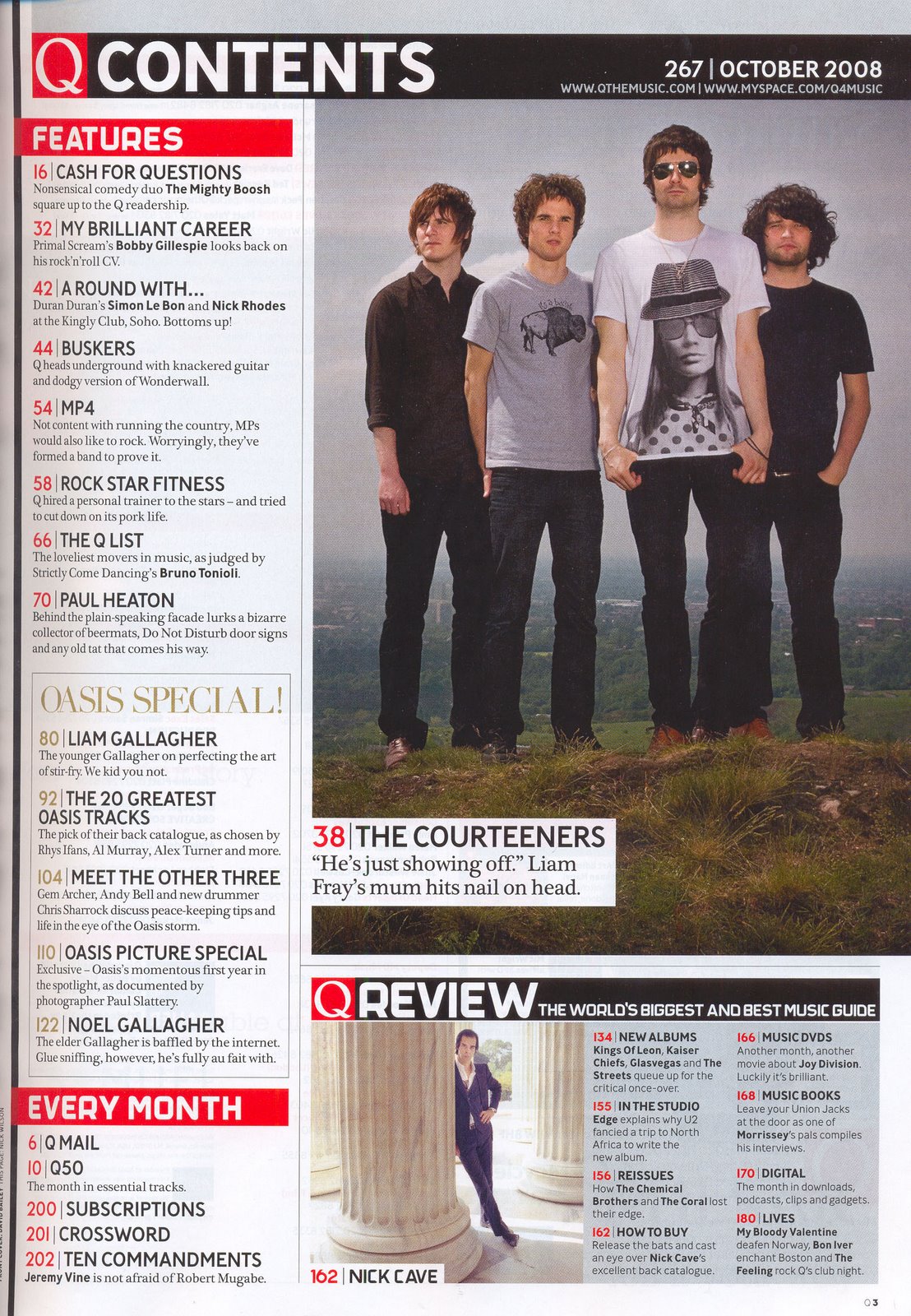

For my music magazine I have to include a contents page, so I have been looking at contents pages; how they are designed and what is put into them. I immediately noticed the images on the contents pages and they seem to have a natural background. Front covers seem to always have a blank background to give pronunciation to the image and also so you can see the text. The design seems to be so the picture is bordered off and the text goes around it. You can see that although the pictures on the Q magazine contents page has staged the images they have a natural setting and the picture doesn't stand out as much as the front cover image would; but the way in which the people look and everything about them tells you they are a band. Again, the NME image on its contents page is a natural image, more natural than the first, and is of them performing to really give it that 'music' feel. However, even though the text is the focal point and reason for this page the image still dominates it by being big and fairly central.
Both contents pages have also kept to their house style, which for these seems to be the use of the colour red. Moreover, NME seem to always put 'NME THIS WEEK' at the top to make the contents page easy to identify. They also include a date with this in order to show the reader how 'up-to-date' they are. Q also inserts the term 'contents' to show the reader what this page is.
The text is obviously what the pages are about. They all seem to use a kind of subheading and then some text underneath giving further information about the page. I am guessing that the subheading is in bigger and bolder writing so you can quickly see what the page is about, and then you read the smaller print if that certain topic has got you wanting to find out more about it before you decide to read the full article.
Pull quotes are used to good effect to give insight to the article. This will then encourage the reader to look at the main article, to greater effect than just subheadings regarding the page's article, and it is used on the main article as that is the band/artist on the front cover which is the main selling point of the magazine, so it will entice the reader further to read it.